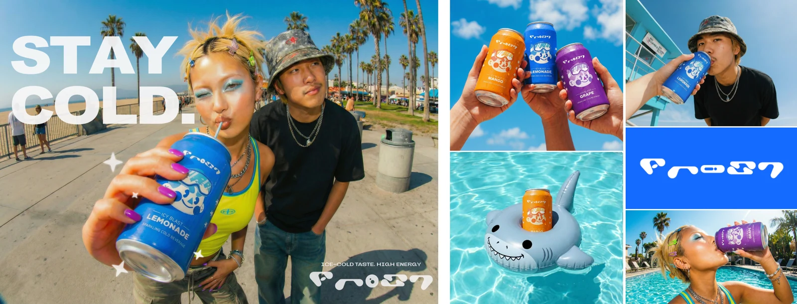
- Nano Banana 3Photorealistic people for the editorial campaign
- Nano Banana 2.5Can mockups, flavour variations and product visuals
- Adobe FireflyGenerative fill, background replacement and image expansion
- ChatGPTPose, framing and styling extraction from reference photos
I treated the project like a real product launch. I designed the logo by hand, refined it with AI, and built the brand identity before creating the product. After designing the flavour system and can mockups, I integrated them into the campaign visuals. The photoshoot was the final step.
The focus was art direction rather than image generation. I defined the visual language with references inspired by Y2K, Harajuku, summer beaches, 0.5 fisheye photography, and saturated colours. ChatGPT helped me break those references into detailed styling, framing, and pose notes that I used to guide NanoBanana. I generated the models first, integrated the cans afterwards, and iterated until the campaign felt like a real summer launch.
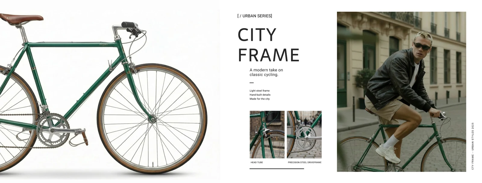
- Nano Banana 3The rider, the bike and the editorial composition
- ChatGPTPrompt engineering and pose extraction from references
The goal was to create a clean, editorial bike campaign inspired by vintage 90s catalogues. I generated the rider and the bike separately before bringing them together into the final visuals.
ChatGPT helped me translate reference images into detailed pose descriptions that guided NanoBanana. I also applied the grain and vintage colour grading directly during generation. The final layout was designed by hand. Composition and typography gave the campaign its finished look.
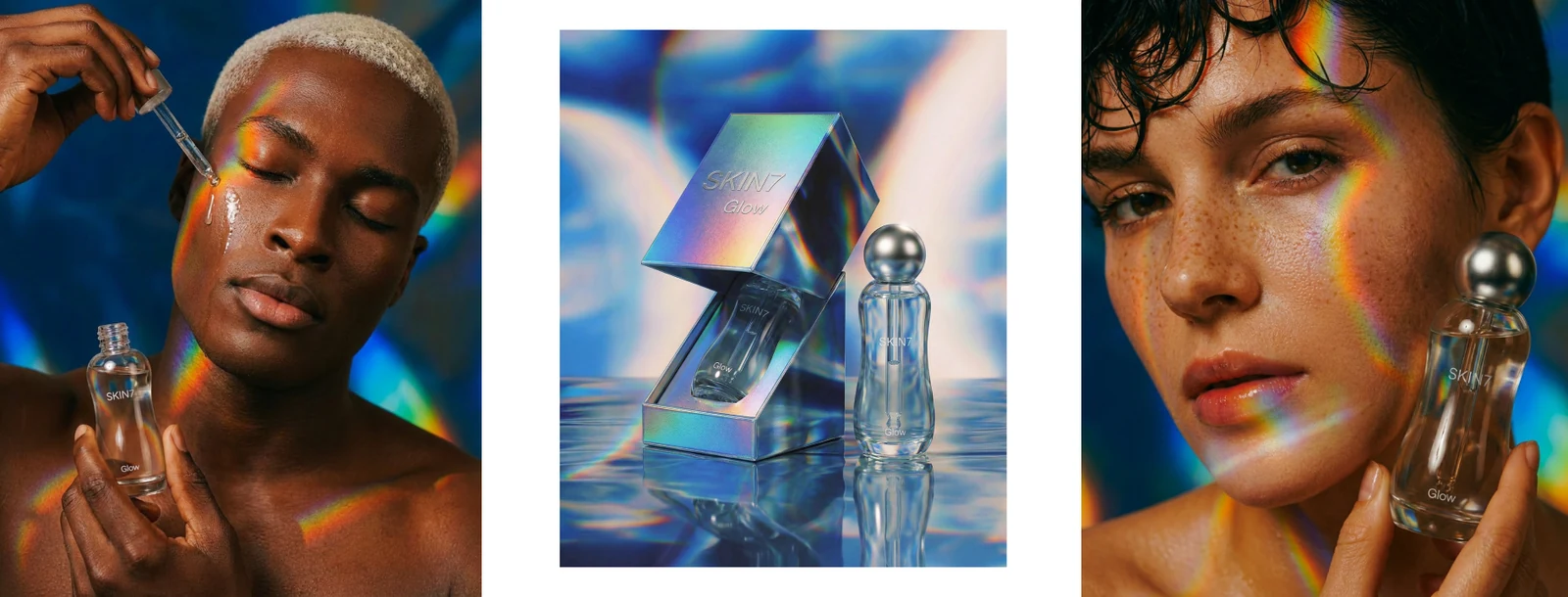
- Nano Banana 3Close-up portraits and full editorial imagery
- Nano Banana 2.5Product bottle, generated as a separate piece
- ChatGPTCreative ideation and prompt refinement
I explored different textures through close-up portraits, dreamy lighting, holographic skin, and prismatic reflections. Alongside the portraits, I created a clean product still life to build a cohesive visual direction.
The result feels soft, polished, and contemporary, with the lighting doing most of the storytelling. It could easily evolve into the visual language of a skincare campaign.